
Verification flow redesign that increased conversion by 5.3%
Carvana's verification step was bleeding sales. 65% of uploaded documents were getting rejected, and 23% of those rejections ended in lost sales. The original brief framed this as a UI and copy problem. After reviewing the verification policies and the actual rejection data, I made the case for a different fix: customers couldn't see the rules they were being judged against. I led the redesign to surface document requirements upfront and shipped a flow that lifted conversion to sale by 5.3%, document approvals by 8.7%, and reduced post-sale document requests by 14.7%.
💡Highlights
- Pushed back on the original brief and made the case for solving the underlying information clarity problem
- Navigated stakeholder disagreement with the CPO by designing both versions of his idea before proposing a hybrid solution
- Established 4 design principles that future verification phases (trade-in, additional income) adopted to keep the flow consistent
📈Impact
- Document approval rate: +8.7%
- Conversion to sale: +5.3%
- Post-sale document requests: -14.7%
Final solution
A key finding that led me to push back on the original brief
Product’s requested solutions
Visual design
User interface
Copy
Content
Information architecture
My proposed solutions
Additional problems emerged but there was hope
I decided to dig deeper and asked my product manager for the verification team’s rejection data. That is where I found more interesting data.
Documents were not only rejected for missing requirements. Many were also rejected because of poor upload quality, such as blurry or cropped photos.
And the rejection rates were high. Income documents were rejected 40-75% of the time and address documents about 40%. But at the same time, recovery rates were also high. Income documents recovered 32% of the time and address documents at 58%. This showed a huge opportunity for us.
At this point, I was confident this was an information clarity problem. Customers did not know what information needed to appear on their documents or the quality required for uploads.
Income
Income
Address
Rejection rate
40% - 75%
32%
Top rejection reasons
Missing required information
Outside the allowed date range
Wrong document type
Address or name isn't clearly visible
Unaccepted or weak document type
Document is too old
Recovery rate
40%
58%
Reframing the problem from UI polish to information clarity
I shared the findings and persuaded my product manager and product director to re-scope the project.
Instead of only improving the document upload UI and copy, we aligned on helping customers upload the right documents correctly on the first try.
This shift also changed how we measured success. Rather than focusing on visual polish, we aligned on clear outcomes:
Fewer rejected documents
Fewer follow-up requests from advocates
Higher verification completion rates
Higher conversion to sale
Designing within strict verification rules
Verification requirements are driven by legal, financial, and risk policies, so my designs had to work within the business constraints.
I asked product and the verification team to review income and address requirements together and align on what should be shown to customers.
Many of these requirements are important for advocates when they're handling exceptions, but not relevant for customers.
We were intentional about what to surface and how to word it, so we didn’t discourage customers from uploading documents or overwhelm advocates with invalid uploads.
Income requirements
Address requirements
IDEATION
Principles for scaling designs beyond the current steps
This phase only focused on income and address verification, but we planned to re-design the remaining verification steps in a future phase.
To keep designs consistent, I established a set of principles that would guide current and future work:
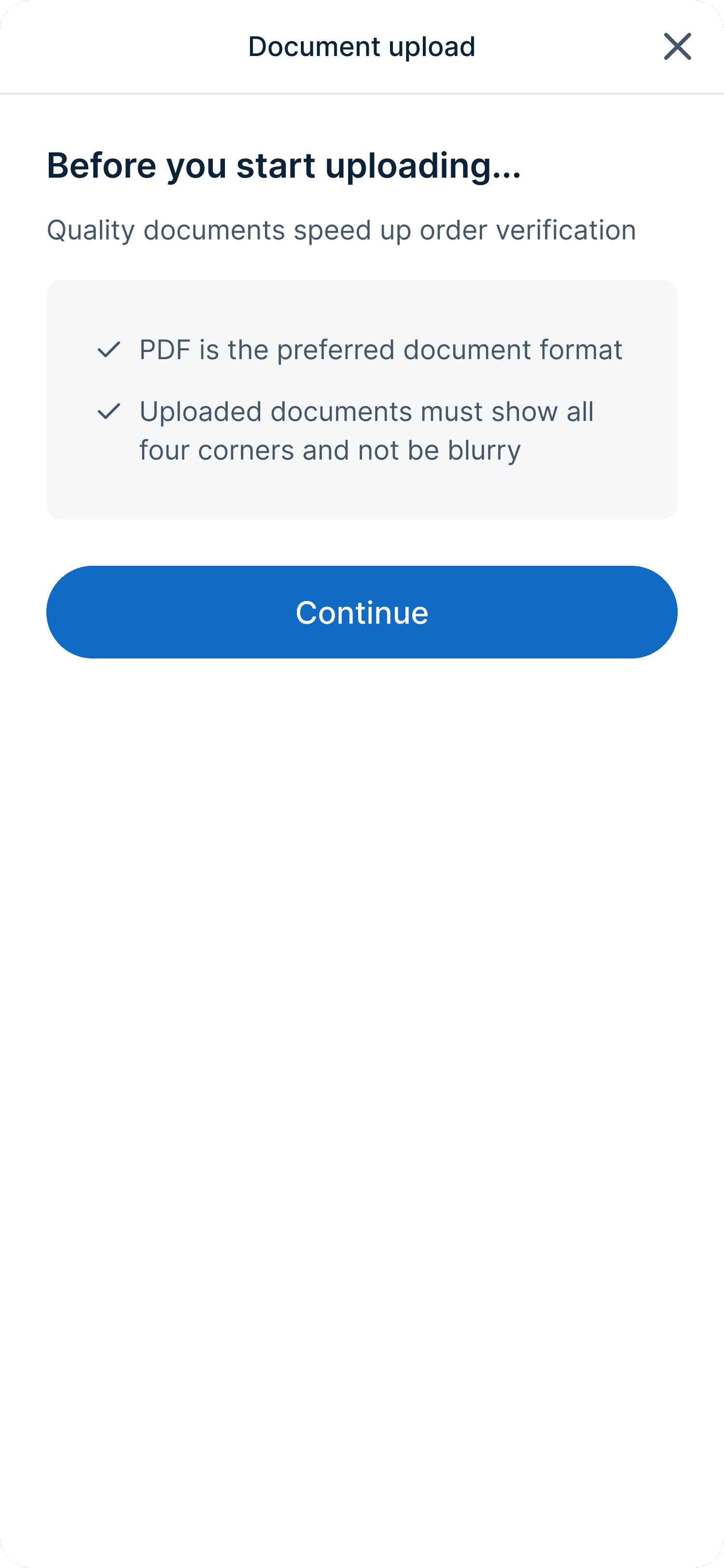
Guide before the action -> Set expectations upfront so users don’t have to re-upload
Show, don't tell -> Use visuals and concise copy because customers only skim
Surface critical info by default -> Don’t bury key requirements behind clicks
Support multi-page uploads -> Required for bank statements and tax documents
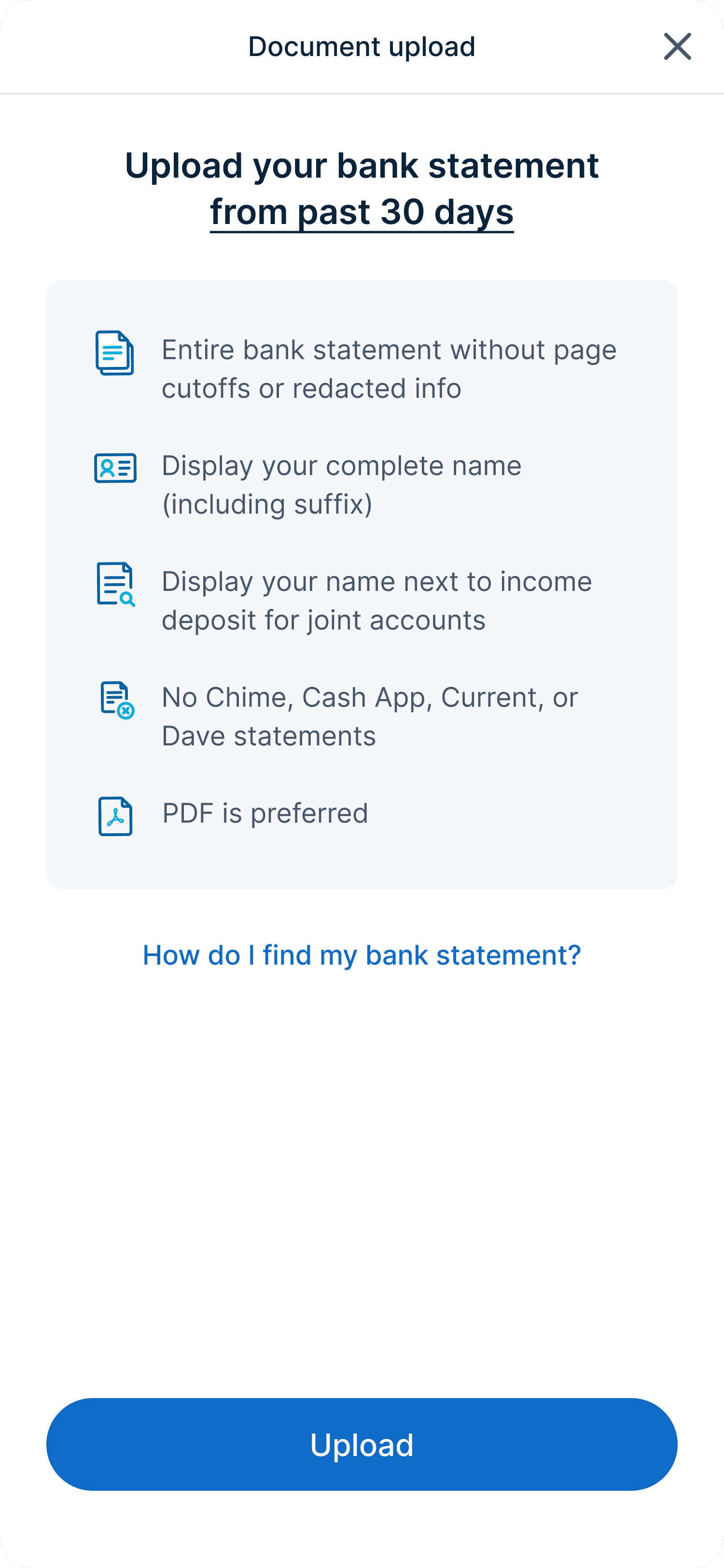
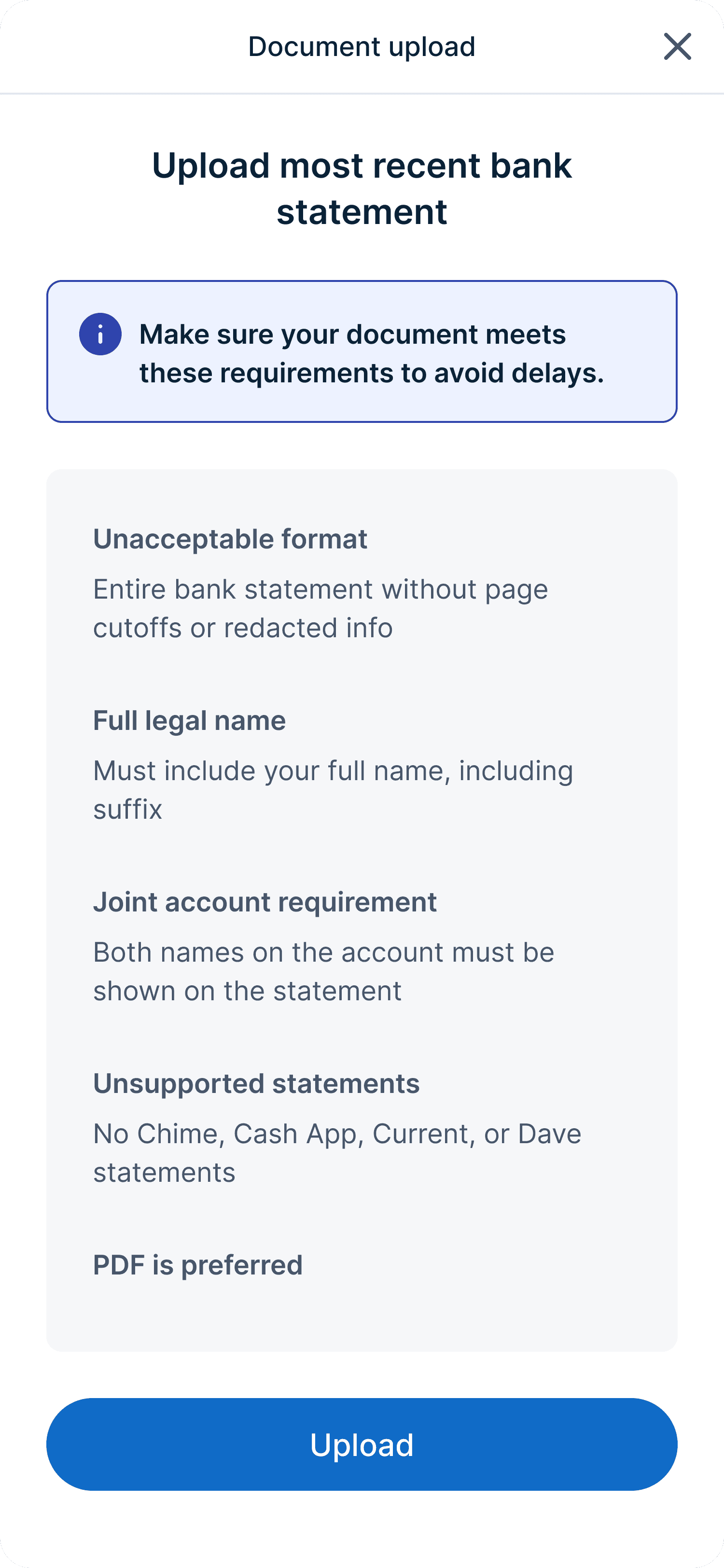
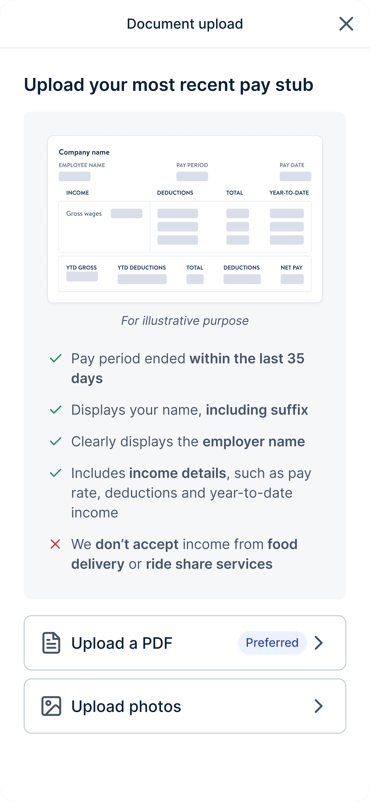
Clear requirements through separated steps and simple copy
I explored different ways to show the requirements. Showing all of them at once was accurate but overwhelming. I wanted to be mindful of how much information customers could process at once.
That's why I landed on a two-step approach:
General requirements that apply to all documents
PDF is preferred, no cut-off, no blurriness
Specific requirements for the document in question
Acceptable date range, income details, employer name, etc
I also worked closely with our UX writer to make sure the copy was easy to read while still being clear and accurate.


Final design (2 step approach)
Version 1
Reason for choosing the winner
By separating general and specific requirements, we made it easier for users to read and follow
A key challenge in address verification exploration
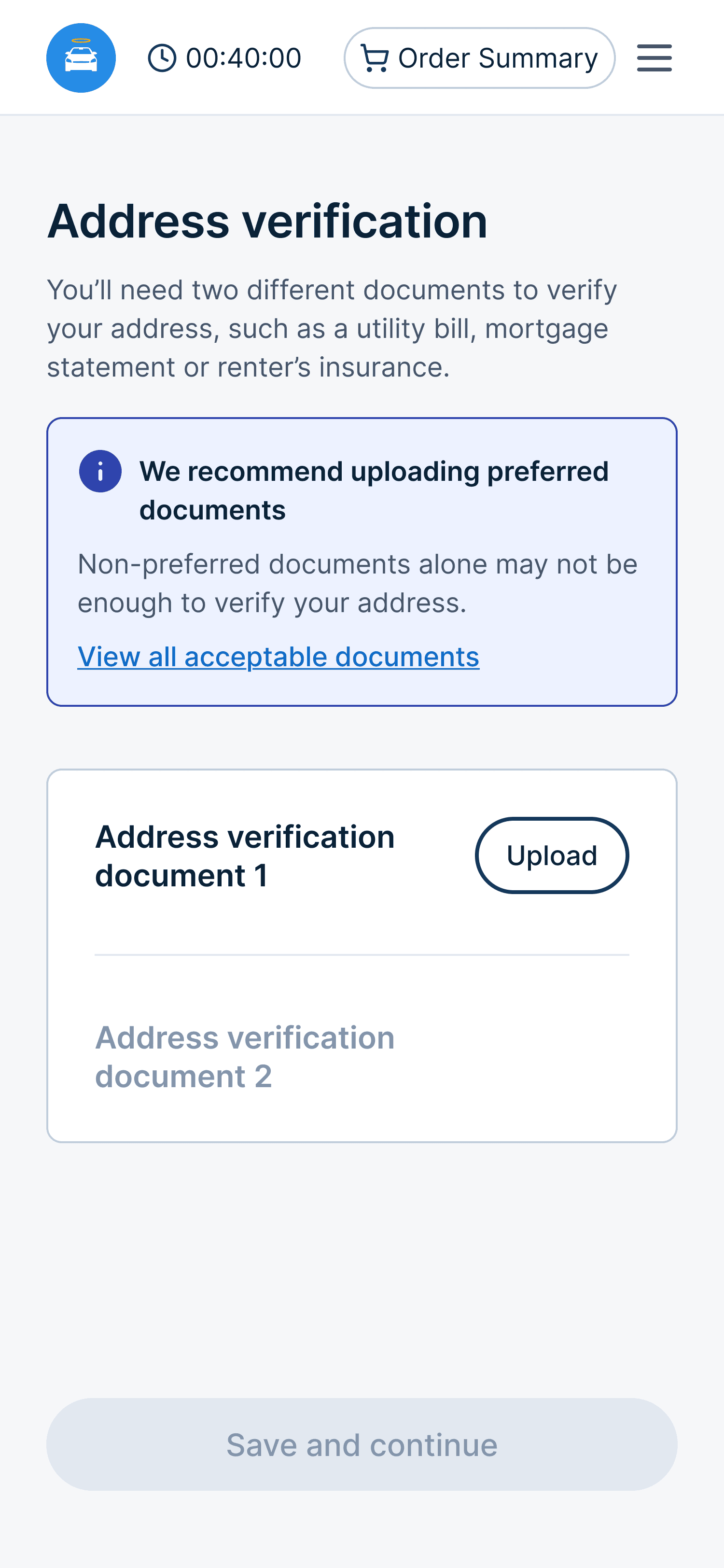
We accepted about 15 address document types but only showed the 6 preferred ones. The others were valid but not preferred and handled case by case. We were essentially blocking customers with non-preferred documents from moving forward.
Given the high recovery rate, I believed we could make address verification requirements more flexible. I raised this idea, but the verification team worried that showing all options would lead customers to upload non-preferred documents that were more likely to be rejected.
I pushed back with real examples, like adults living with family who don’t have property related documents but can still finance a car.
And to address their concern, I proposed showing only preferred documents by default, with the full list available behind a click and a clear warning about the risks of submitting non-preferred documents.
The verification team agreed, and we moved forward with this solution.


Standing firm on what actually mattered
Since this was a high-visibility project, I reviewed the designs with our CPO. He liked the direction but suggested adding sample documents to help customers know what to upload.
While this idea seemed helpful, it didn't solve the problem. Customers knew what bank statements and paystubs look like. What they were missing were clear requirements.
But instead of dismissing the idea, I explored it so we could evaluate the impact together. I shared the designs and explained why sample documents wouldn't help reduce rejections.
The stakeholders agreed but didn't see any harm in keeping the sample documents. So I proposed a hybrid solution. The final design led with clear requirements and kept sample documents available as optional help, without adding visual noise to the main flow.

Embedded sample document

Link to sample document


The data validated that we made the right decisions
We ran the experiment for 6 weeks across 2 cohorts and the results were great. Customers uploaded higher-quality documents, fewer re-uploads were needed, and more purchases made it through verification.
This validated our hypothesis: clearer requirements upfront reduce rejection and downstream support work.
8.7%
Approved documents per purchase
The new document requirements list significantly increased document approval rates
5.3%
Conversion to sale
When more documents are approved, more purchases go through, directly increasing conversion
14.7%
Post-sale document requests
With more documents approved on the first try, advocates had to ask fewer customers for additional documents
Want to see more of my work?
Check out my other case studies, or reach out to me at


