BACK
Improving the Financing Page

Context
When I joined the company, my team had just finished redesigning the financing terms page. While visually appealing, this new design caused a drop in conversions. Tasked to rethink the user experience, I created a solution to re-gain our conversion rate
Challenges
The original re-design introduced many new changes which made it hard to pinpoint what didn’t work
Our Finance API didn’t pass through precise terms and we had to launch with this deficiency
Objectives
Business
Boost conversions by clarifying financing terms
User
Improve user comprehension and instill confidence
Role
I was the only designer on this team. That means I worked on all the new designs you see here
Research Findings
Reached out to data analyst for quantitive data
Why
To analyze the conversion rate on the Financing step and discuss other potential factors for de-conversion
Findings
The new Financing page has a 2% lower conversion rate
Reached out to Customer Experience team for qualitative data
Why
To understand what our users’ pain points and confusions were
Findings
Over half of the analyzed support tickets were questions about financing (28%), trade-ins (15%), and payments (14%)
Audited the old design and the initial redesign
Why
To uncover the discrepancies to come up with a hypothesis to validate
Findings
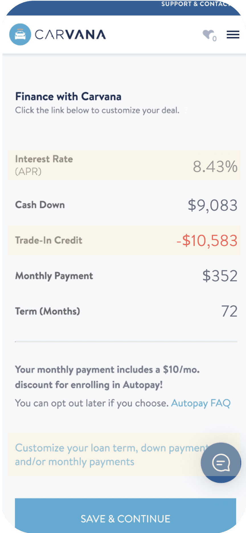
We were offering two sets of financial terms instead of just one
Highlighted the application of trade-in value but failed to fully explaining its impact
Used social proof which wasn’t suitable given that finances are highly personal
Hypothesis
The new Financing page was too complex with two options and didn't clearly explain terms and trade-in details
Impact of Design
Improved conversion rate from -1.3% to +3.4%
16.8% decrease in finance related inquiries and a 12.6% decrease in trade-in related inquiries
Special Highlight
I pushed hard and negotiated with the engineering team to incorporate the Trade-in module on the Financing page, enabling users to see how their trade-in impacts their financing terms in real time
Audit of Old Design and Initial Redesign
Long hyperlink format for customization made some users overlook it, as they were more accustomed to shorter CTAs
Negative equity users didn't realize that $2.5k was applied to their loan, with the rest as a down payment
Interest rate is not what our users care about the most
Original


Initial Redesign


We mentioned trade-in value but didn't clarify its impact on the terms or specify the tax savings
Design Explorations
Exploration 1


PRO
A single set of terms
Explains whether the trade-in reduces or increases down payment
Customization within context of the terms
CON
Treats all elements equally
Still vague on the impact of the trade-in
Doesn’t explain required minimum down payment
Exploration 2


PRO
A single set of terms
Breaks down the down payment better
Customization within context of the terms
CON
Treats all elements equally
Still vague on the impact of the trade-in
Exploration 3


PRO
A single set of terms
Breaks down the down payment better
Emphasizes the monthly payment
Customization within context of the terms
CON
Still vague on the impact of the trade-in
Additional down added is not as clear as minimum required down
Final Solution
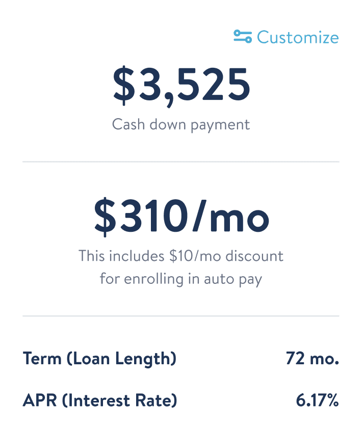
Emphasized down payment
Discoverable customize feature
Emphasized monthly payment and pulled in the autopay disclaimer
De-emphasized loan length and APR since these are secondary information


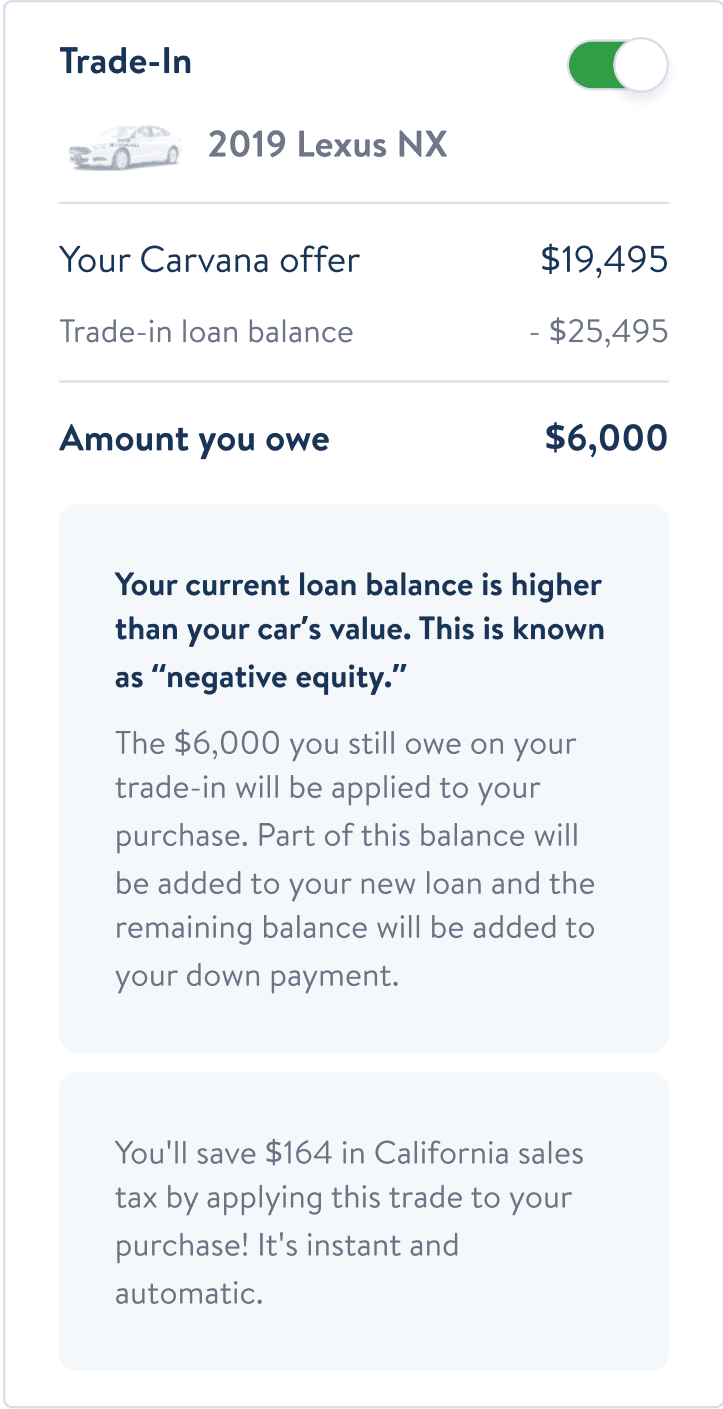
Clear breakdown of the trade-in value
Toggle to attach or detach trade-in
Further explained the impact of the trade-in on down payment and monthly payment
Highlighted the tax saving to incentivize users to attach trade-in
Prototype

Lessons Learned
Business and technical limitations are common in projects, and I make it a point to thoroughly understand these challenges and discuss them with my stakeholders.
For instance, I had to adjust the design due to system limitations and a tight deadline. My product partners prioritize rapid launches, sometimes sacrificing user experience. While I understand this approach, I believe in advocating for the optimal solution and persistently working towards it.

special thanks to my team
Manager
John Sanchez
For offering valuable feedback and assisting me in delving deeper into the issue
Product Design Director
Anthony Puglisi
For giving an overview of the larger system and explaining the complexities and implications of our financing logic
Product Manager
Dan Salamone
For being a supportive partner and effectively coordinating discussions with various team members
Product Director
Paul McReynolds
For offering strategic and high-level feedback
Engineering Director
Bryan Iams
For providing a realistic overview of what to expect in terms of the implementation process and timeline
Engineers
Arick Hanna &
Eric Stone
For successfully implementing my designs while navigating our complex and outdated codebase
CX & Finance team
For their invaluable insights and support in bringing this redesign to fruition
Designed in Figma and Built in Framer © 2024 Selena Jiang. All Rights Reserved.